Mina the Hollower Color Palette & Art Style: A Complete Visual Guide
An in-depth exploration of the Game Boy Color-inspired pixel art behind Yacht Club Games' gothic masterpiece, from its 64-color custom palette to the meticulous tilework that brings Tenebrous Isle to life.
When Yacht Club Games announced Mina the Hollower in February 2022, the immediate reaction from fans was recognition. Not recognition of a familiar IP, but recognition of a feeling -- the warm, intimate nostalgia of peering into a tiny Game Boy Color screen in the backseat of a car, illuminated only by passing streetlights. That is precisely the emotional target the studio aimed for.
"If you can imagine a timeline in which you visited your local game shop in the early 2000s and saw Mina the Hollower on a shelf next to your favorite handheld games of the era, we've done what we set out to accomplish," the team wrote in their definitive blog post, The Art of the Game. That philosophy -- honoring limitations while selectively breaking them -- defines every visual decision in Mina the Hollower.
This guide breaks down every facet of the game's visual identity: the 64-color custom palette, the sprite philosophy, the tile artistry, the retro CRT and scanline effects, and how it all compares to the studio's previous masterpiece, Shovel Knight. Whether you're a pixel artist looking for technique references or a fan curious about what makes the game look the way it does, we have you covered.
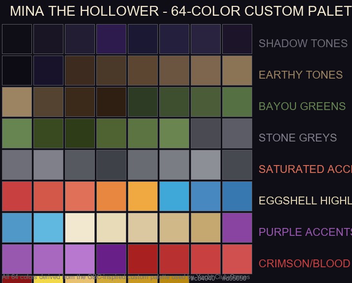
The complete 64-color custom palette used in Mina the Hollower, organized by category -- from shadow tones to eggshell highlights. Each swatch represents a specific hex value derived from the Game Boy Color-inspired palette.
Why Game Boy Color? The Handheld Retro Aesthetic
Just as Shovel Knight imagined a world where NES-era console aesthetics never stopped being refined, Mina the Hollower does the same for portable gaming. In their Art of the Game blog post, Yacht Club Games explained the philosophy clearly: "Everything about Mina the Hollower, from gameplay to visuals, takes inspiration from a veritable pantheon of portable games and consoles, especially the games and presentation found on Nintendo's Game Boy and Game Boy Color."
The key inspirations are unmistakable: The Legend of Zelda: Link's Awakening DX, Oracle of Seasons, and Oracle of Ages form the structural backbone. But the team also drew from Dragon Quest III for its detailed, textured tilework that conveys a lived-in world, Survival Kids for its weathered, naturalistic environment tiles, and Dragon Quest Monsters for its creative use of custom tile pieces to break up repetitive patterns.
Developer Insight -- Nick Wozniak (Pixel Artmancer)
"We wanted to establish clear art restriction rules early, using a restrictive palette to keep the game feeling cohesive. The GBC had over 32,000 colors available but only 56 on screen -- we had to find the sweet spot between nostalgic limitation and modern readability."
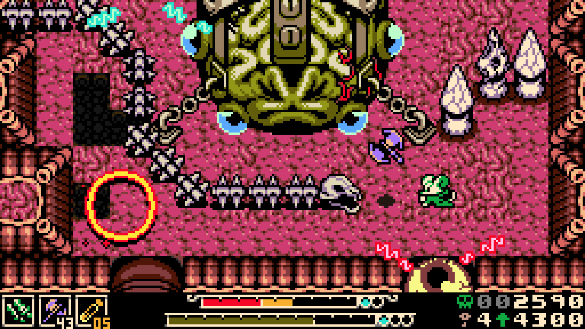
The studio's goal was never to build an actual Game Boy Color ROM. Mina the Hollower runs at 60 frames per second, renders in a 256x144 widescreen resolution (versus the GBC's 160x144), and supports far more simultaneous sprites and background layers than real hardware could handle. As the developers put it, the aim is a "next-gen Game Boy Color game" -- one that matches your rosiest-tinted memories of the era rather than its actual technical reality.
The 64-Color Custom Palette: Breaking Down Every Shade
The most significant lesson Yacht Club learned from Shovel Knight was that hardware-defined palettes can be too restrictive. The NES palette of 56 colors forced them into high-contrast color combinations that sometimes felt harsh. For Mina, they took a different approach: build a custom 64-color palette from scratch.
"We pored over some of our favorite portable titles trying to pinpoint what makes a GBC game look like a GBC game," the team wrote. After months of iterating, combining like-colors into distinct gradients, and refining based on how the colors actually looked in-game, they arrived at the final 64-color palette that has remained largely unchanged since the beginning of production.
Shadow Tones -- The Foundation
The palette opens with deep, inky blacks and dark purples that serve as the visual bedrock. Colors like #0f0e17 (near-black) and #1a1525 (deep violet-black) define the gothic atmosphere. Unlike the bright, primary-colored worlds of Link's Awakening, Mina's Tenebrous Isle is shrouded in darkness -- the menu HUD itself uses black as its predominant color, a deliberate departure from the light-colored menus ubiquitous on actual Game Boy Color games.
Earth and Stone -- Grounding the World
"We made efforts to add a variety of cool, earthy tones to the palette intended to evoke a moody atmosphere," the team explained. Colors like #5c4632 (rich soil brown) and #4a4a52 (cold stone grey) make crypt walls feel genuinely cold and dank, while the bayou undergrowth appears lush and wild. These are hues you might find in the real world, contrasting sharply with the exaggerated, highly saturated palettes of handheld Zelda titles.
Bayou Greens -- The Natural World
Nox's Bayou and other natural areas benefit from a range of moss greens and muted vegetation tones. Colors like #4a5d38 and #668550 create the distinct "creamed spinach" aesthetic that fans of the original Link's Awakening will recognize -- but pushed darker and more foreboding. This is a bayou that feels dangerous, not pastoral.
Saturated Accents -- Making Gameplay Pop
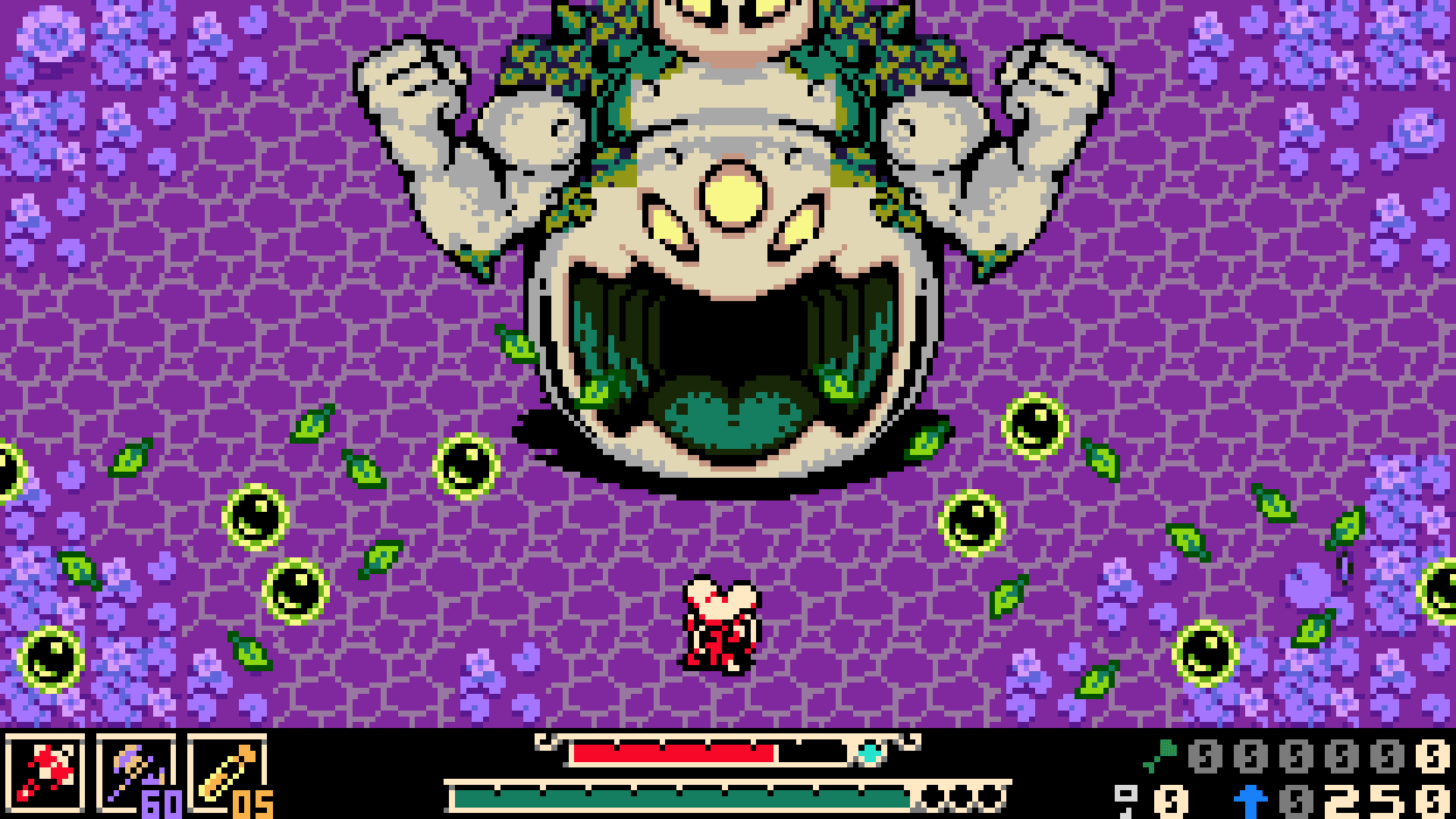
The most important color strategy in the palette is the deliberate split between background and foreground saturation. Saturated hues like #c84040 (bold red), #e88840 (vibrant orange), and #40a8d8 (bright blue) are reserved exclusively for sprites and gameplay objects. This technique, borrowed directly from the Game Boy Color Zelda titles, ensures that enemies, items, and Mina herself always visually pop off the muted background. Your eye never loses track of what is interactable.
The Eggshell Highlight -- Mina's Visual Signature
Perhaps the single most defining color choice: where Link's Awakening DX famously used a bright, sunny yellow as its universal highlight color, Mina the Hollower replaces it with an eggshell cream -- colors like #f2e8d0 and #e8dcb8. This single substitution recontextualizes the entire visual identity. "That yellow really defines the Link's Awakening DX aesthetic in our brains," the team wrote. By using eggshell instead, Mina immediately looks distinct from its inspirations while remaining legible and easy on the eyes.
Gold and UI Accents
The warm gold tones -- #e8c170, #d0a838 -- are used sparingly for UI elements, treasure indicators, and important interactive cues. Paired with purple accents (#8844a0 through #b878d0), they create a regal, Victorian-gothic feel appropriate to Mina's 1700s-inspired world.
Pixel Art Techniques: Sprites, Tiles, and the 4-Color Rule
Mina the Hollower adheres to strict Game Boy Color hardware-inspired constraints when it comes to sprites and tiles. Understanding these constraints is key to appreciating the craftsmanship behind every pixel.
The 4-Colors-Per-Tile Rule
Every art asset in the game conforms to the GBC's palette restriction: only 4 colors per 8x8 pixel tile, including black and transparency. In practical terms, this means character sprites are typically limited to just 2 active colors per tile -- a remarkable constraint given how expressive and readable the final sprites are.
The team made a considered decision to vary the highlight colors across different sprites, rather than using the same off-white across the board (as many real GBC games did). "Because we're not beholden to the same limitations, we're able to bend the rules in small ways while still playing to nostalgia," they explained. This gives each character a touch more visual uniqueness.
Sprite Subdivision -- The Boss Weapon Exception
The 2-colors-per-sprite rule has one notable exception: sprite subdivision along the 8x8 pixel grid. "Something like a big helmet or large weapon could get its own color as long as the separation happens within an 8x8 pixel space," the team noted. This has a dual benefit -- it adds visual variety and improves gameplay readability. When a large boss is one color but their weapon is another, the player instantly knows what to avoid in battle.
Character Portraits -- The Fourth Color Advantage
Character portraits in dialogue sequences are always displayed on a solid black backdrop with no transparency. This frees up one additional color (since transparency is not needed), allowing artists to sneak in extra detail when zooming into a character's face. The portraits are designed to answer the question: "Does the big art reflect the way you imagined these characters to look based on their tiny sprites?"
Tile Texture Philosophy
Rather than relying on abstract geometric patterns common in many GBC games, Mina's background tiles emphasize texture: cracked stone, weathered wood, carved architectural details. The team specifically cited Dragon Quest III as their gold standard for this approach, praising how it "uses texture to accentuate the time-worn, lived-in feel of the environments." Custom one-off tiles appear throughout Mina's world to prevent visual monotony and reward attentive exploration. "We want players to feel like they're exploring a world and not just a level."
Mina the Hollower vs. Shovel Knight: A Tale of Two Art Styles
Both games share the same DNA -- Yacht Club Games, retro pixel art, self-imposed hardware limitations -- but they represent fundamentally different visual philosophies. Understanding the contrast illuminates what makes each game special.
Shovel Knight
- Era Emulated: 8-bit NES/Famicom (1985-1990)
- Perspective: Side-scrolling 2D platformer
- Palette: 56-color NES palette + custom additions
- Resolution: Higher (400x240 base)
- Tone: Bright, heroic, upbeat
- Color Philosophy: Vibrant, high-contrast separation
- Inspirations: Mega Man, DuckTales, Castlevania III
Mina the Hollower
- Era Emulated: Game Boy Color (1998-2003)
- Perspective: Top-down action-adventure
- Palette: Custom 64-color, built from scratch
- Resolution: Lower (256x144, widescreen)
- Tone: Gothic, moody, "creepy Halloween vibes"
- Color Philosophy: Muted backgrounds, saturated foreground
- Inspirations: Zelda Oracle games, Bloodborne, Castlevania
Nick Wozniak described the shift from Shovel Knight to Mina as a "big mood swing" -- moving from a world where "everything is really cutesy, and everybody ends up happy" to something darker, spookier, and more atmospheric. Sean Velasco, the game's director, famously summarized the relationship: "If Shovel Knight is our Mario, Mina would become our Zelda." That tonal and mechanical distinction is embedded in every color choice.
Another key difference: Shovel Knight used the NES palette for its entire visual identity, which sometimes forced high-contrast combinations. Mina's custom palette, with its smooth color ramps from dark to light, gives the artists "more control over your art. More control, hopefully, leads to a more cohesive visual aesthetic." The result is a game that feels more visually unified and atmospheric, even at a lower effective resolution.
Character Design Philosophy: Mice, Monsters, and Minimal Pixels
Designing expressive, memorable characters within a 2-color-per-sprite limitation is a staggering challenge. Yet Mina the Hollower's cast manages to convey personality, emotion, and menace through remarkably few pixels.
Mina Herself -- The Mouse Adventurer
Mina is an anthropomorphized white mouse, and her design leans into silhouettes and distinct shapes to ensure readability. Her large mouse ears, flowing cloak, and signature weapon (a spiked flail/whip-mace or quick daggers) are instantly recognizable even at the GBC-inspired resolution. The eggshell highlight color is used extensively in her sprite to make her pop against the dark, gothic backgrounds -- she is designed to be the brightest thing on screen at most times.
Her burrowing ("Hollowing") animation is one of the game's standout visual moments -- a fluid sequence where she dives underground, creates a distinctive dirt trail, and bursts back to the surface. The animation sells the physicality of burrowing through soil despite the minimal frame count, a testament to the animation team's skill.
The Anthropomorphic Cast
Set in a 1700s gothic horror world populated by anthropomorphic animals, the character designs draw from Victorian fashion, classic monster literature (Dracula, Frankenstein, Dr. Jekyll and Mr. Hyde), and the studio's stated influences of Secret of NIMH and Bloodborne. Each NPC species has distinct visual markers that read clearly even at low resolution -- a fox character might have a pointed snout and tail, a bird character has a distinctive beak profile, and so on.
Reviews consistently praise the expressiveness achieved within the pixel constraints. One reviewer noted that characters have "a lot of expression behind them despite not having many pixels to work with," while another described the emotional delivery as "more sophisticated than in almost any other game" working within similar limitations.
Environment Art and World Design: Building Tenebrous Isle
Tenebrous Isle is not just a backdrop -- it is a character in its own right. The interconnected world design draws favorable comparisons to Dark Souls and Hollow Knight, with zones that loop back on each other and reveal secrets through careful observation.
Zone-Specific Palettes
Each major zone in the game has its own sub-palette within the 64-color framework. Nox's Bayou leans into the moss greens and murky browns -- Yacht Club shared early mockups showing the visual evolution from overly saturated test tiles to the final, more muted bayou palette. The hub city of Ossex uses the stone greys and warm golds to evoke a Victorian urban center. Dungeon interiors pull from the shadow tones and cool purples to create a sense of subterranean dread.
The Parallax Advantage
One of the "next-gen" concessions the team made: parallax scrolling. Multiple background layers scroll at different rates as the camera moves, creating an unparalleled sense of depth in 2D space. While some later GBC games did experiment with parallax effects, Mina deploys it extensively and smoothly. The team also simulated horizontal interrupts -- a hardware trick from the GBC era -- to create per-row background visual effects. These are used for wacky screen transitions between levels and atmospheric VFX like fog rolling across a graveyard.
Visual Storytelling Through Environment
The game's art director (Nick Wozniak) described the visual approach as creating "spooky, lived-in environments" where every tile tells a story. Cracked stonework suggests ancient construction, weathered wood planks hint at decades of neglect, and carved architectural details reward players who pause to examine their surroundings. This philosophy borrows heavily from Dragon Quest III's approach to worldbuilding through environment art.
UI Design and Typography: The Black HUD Decision
One of the most striking departures from GBC convention is Mina's user interface design. Where the overwhelming majority of Game Boy Color games -- especially the Zelda titles that Mina draws from -- used light-colored menu backgrounds, Mina commits to a black HUD.
"In keeping with the macabre themes of Mina, we chose to use black as the predominant color in our HUD, even though light-colored menus are ubiquitous on Game Boy," the team explained. This decision has practical benefits beyond aesthetics -- the black HUD recedes visually, keeping the player's focus on the game world rather than peripheral UI elements. It also reinforces the gothic horror tone every time the player opens a menu or checks their inventory.
The text rendering itself is a feat within the constraints. At 256x144 resolution, each pixel is precious, and fitting readable text into dialogue boxes required careful font design. The pixel font used in Mina's UI is crisp and legible, using the eggshell highlight color for maximum contrast against the black HUD background. Gold accents appear for important UI elements like bone counters (Mina's upgrade currency) and key item indicators.
CRT, Scanlines, and Retro Display Effects
Mina the Hollower renders its pixel art in clean, sharp pixels by default -- no built-in CRT filters, no scanlines, no simulated LCD grid. This has been a point of community discussion. On forums like RetroGameTalk, players have expressed that the game would benefit from built-in GBC-style display filters, noting that old LCD screens and CRT displays gave pixel art a distinctive look that raw pixel output on modern monitors cannot fully replicate.
However, the community has stepped in to fill the gap. A modder known as BonusJZ created a popular CRT shader mod available on Nexus Mods that adds:
Scanlines
Horizontal line patterns mimicking a CRT tube display, adding a layer of visual texture
Phosphor Glow
Simulated color bleed and soft bloom, as colors would blend on old cathode-ray screens
LCD Grid
An alternative preset that mimics the original Game Boy Color LCD matrix pattern
For players on 1440p displays, the mod recommends setting in-game pixel size to x9 and pixel scale to FIT for proper scanline alignment. The shader toggles between presets using the PageUp key, letting players instantly compare the raw pixel look against the CRT-filtered version. While optional, these community tools complete the retro visual experience for purists who want their "next-gen GBC game" to look like it is running on period-appropriate display hardware.
Gameplay Readability: Why the Art Style Matters for Play
The visual choices in Mina the Hollower are not purely aesthetic -- they serve critical gameplay functions. The most important principle is the foreground-background saturation split: muted, earthy tones for the environment, and bright, saturated colors for anything the player can interact with. This is not a new technique (it was standard practice on the Game Boy Color), but Mina executes it with exceptional discipline.
What Pops: Saturated Colors
- Enemy sprites and attack telegraphs
- Collectible items and bone pickups
- Mina's own character sprite
- Interactive switches and levers
- Boss weak points and weapon hitboxes
- Health and damage indicators
What Recedes: Muted Tones
- Wall tiles and floor textures
- Background environmental detail
- Atmospheric effects (fog, shadows)
- Non-interactive set dressing
- Distant parallax layers
- HUD and menu backgrounds
This color hierarchy is especially important for a game with challenging, deliberate combat. Mina's combat draws comparisons to Castlevania and Bloodborne in its emphasis on positioning, timing, and reading enemy tells. In a boss fight, the boss's weapon being a different color from the boss's body (made possible by the sprite subdivision technique) instantly communicates the danger zone. The player does not need to consciously analyze what they are seeing -- the color coding does the work subconsciously.
The burrowing mechanic also benefits from this visual language. When Mina Hollows underground, the dirt trail uses a distinct earth tone that contrasts against both background tiles and interactive elements, making it impossible to lose track of her position even in chaotic combat scenarios. At 256x144 resolution with chunky pixels, every visual cue must earn its place on screen. Nothing in Mina the Hollower's art is wasted.
Fan Art Community: Celebrating the Pixel Art Legacy
Mina the Hollower's distinctive visual identity has inspired a thriving fan art community that rivals the enthusiasm Shovel Knight generated. The game's announcement in February 2022 immediately sparked a wave of pixel art tributes, character reinterpretations, and high-resolution reimaginings of the GBC-inspired style.
Official Fan Art Contests
Yacht Club Games actively nurtured this community, hosting official fan art contests around the game's announcement and encouraging pixel and sprite art submissions. The studio personally commended standout submissions for quality, shading accuracy, and creative reinterpretation of Mina's world. This developer-community relationship mirrors the approach they perfected during Shovel Knight's post-launch support cycle.
Where to Find Mina Fan Art
The fan art ecosystem spans multiple platforms:
- DeviantArt -- Artists like Baron-Engel have posted numerous Mina fan art pieces, including cosplay-inspired character designs and crossover concepts.
- Twitter/X -- The most active hub. Artists like @TommoTheCabbit and @flipskip1 garnered hundreds of likes on sprite-style fan art within days of the announcement.
- Danbooru -- High-resolution pixel art mockups that reimagine Mina's sprite style, often depicting action scenes from the game's concept art.
- Fur Affinity / Weasyl -- The anthropomorphic character designs resonated particularly strongly with the furry community, which has produced extensive fan illustrations and animations.
The fan art community has even extended to functional assets -- PNGTuber avatars of Mina, animated pixel sprites for stream overlays, and custom palette swaps that reimagine the game in different color schemes (sepia, monochrome Game Boy green, and even a NES-style palette). This creative engagement speaks to how effectively Yacht Club's visual design resonates: the palette is restrictive enough to be learnable, but expressive enough to inspire endless reinterpretation.
Developer Tools and Workflow: How the Art Gets Made
For pixel artists interested in the technical side, Yacht Club has shared some details about their production pipeline. All sprite work in Mina the Hollower is done in Pro Motion NG, a specialized pixel art and animation tool favored by many professional pixel artists for its robust tile management and palette control features.
A unique production challenge: every sprite must be drawn at least three times to cover all directional angles in the top-down perspective (facing up, down, and side -- with the side sprite mirrored for left/right). This multiplies the animation workload significantly compared to side-scrolling games like Shovel Knight, where sprites only need left and right facings.
Under the hood, Mina the Hollower does not actually use sprite-based rendering in the traditional sense. The game engine draws "textured triangles, not sprites" -- making it technically closer to modern titles like The Legend of Zelda: Tears of the Kingdom than to Link's Awakening in terms of how the rendering pipeline operates. The pixel-art appearance is the result of careful asset preparation and deliberate resolution constraints, not emulation of legacy hardware.
The 64-color palette itself was developed through extensive iteration -- the team described the process as "dumping all of our LEGOs on the floor and trying to pick out our favorite pieces before laying the brickwork." Starting from an initial pool of candidate colors pulled from reference GBC games, they repeatedly tested colors in actual game scenes, identified gaps and imbalances, and refined until the palette felt cohesive across every zone and lighting condition in the game.
Conclusion: Why Mina's Art Style Endures
Mina the Hollower's visual identity succeeds because it understands something fundamental about pixel art: constraints create character. The 64-color custom palette, the 2-colors-per-sprite rule, the eggshell highlight substitution, the black HUD, the saturated-foreground-muted-background split -- every decision serves both aesthetic and functional purposes. Nothing is purely decorative.
The result is a game that looks simultaneously nostalgic and fresh. It evokes the handheld gaming era of the late 1990s and early 2000s without being trapped by it. As The Guardian's review put it, the game creates a "snow-globe reality that you peer into from above" -- intimate, detailed, and utterly absorbing. Critics have widely praised the game as one of 2026's best, with many citing the art direction as a standout achievement.
For fans of pixel art, Mina the Hollower is essential viewing -- a masterclass in how to honor retro aesthetics while building something unmistakably modern. For players, it is simply a beautiful world to get lost in, one 8x8 tile at a time.
Related Articles
- Mina the Hollower Review Roundup: What Critics Are Saying
- Mina the Hollower Platform Comparison: Switch vs PC vs Xbox
- Mina the Hollower on Steam Deck: Performance and Settings Guide
- Mina the Hollower Price: How Much Does It Cost on Each Platform?
- How Long to Beat Mina the Hollower: Main Story and 100% Completion
- Mina the Hollower Physical Release: Collector's Editions and Retail Availability

Loading comments...